Some animated Dutch COVID-19 Figures
Don’t take this too seriously. As part of my coping mechanisms, I try to understand the latest (Dutch) COVID-19 figures. I documented where to get the raw data and what they mean in an earlier post.
Please note I am not trying to make any kind of point with this data, not positive, not negative. I have no agenda, please do not read this as me trying to argue things aren’t that bad or that they are terrible.
You can look at the Dutch data in many ways. One interesting way is to benefit from the ‘date of onset’ field, which is often set. This means that if more testing becomes available, an increase in tests shows up around the time people fell ill, and not at the time of their test. Arguably this is more interesting. It also means vagaries of testing delays influence data less.
When people get tested, they often report onset of symptoms up to ten days ago. So we are definitely looking at the past. This means that if we plot the number of COVID-19 cases reported to have started on day X, it may take 10 calendar days before the number for day X is stable.
So let’s say we care about October 1st, people will continue to get tested who report October 1st as their first day of symptoms until October 10th easily.
So if we want to look at the growth in daily reported numbers, possibly to see if we have passed a peak maybe, you can’t just take today’s plot. Incidentally, that plot looks like this:
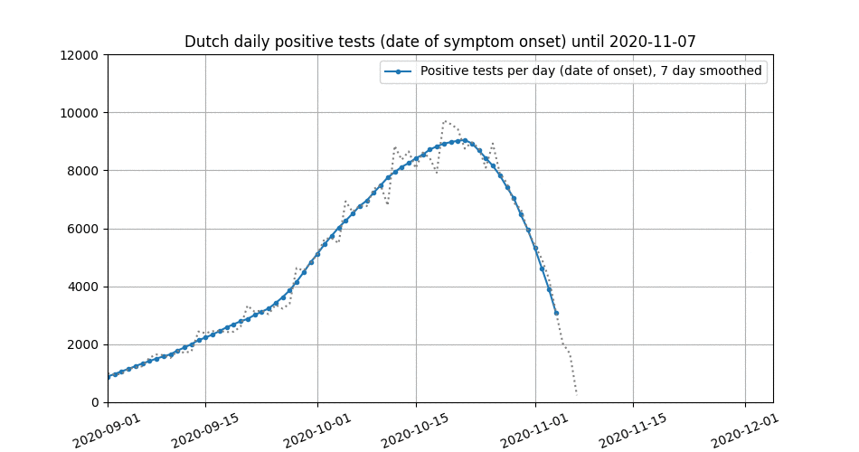
Dutch COVID-19 cases (mostly) by date of onset. Dropoff at the end is not real.
To still see what we can make of this, I made this animation which shows how the growth in daily testing evolves over 27 days of data:
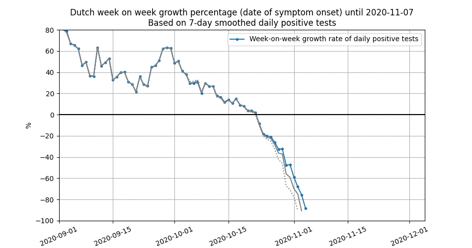
Growth in Dutch COVID-19 cases (mostly) by date of onset
The data is based on 7-day smoothed daily positive test numbers. The 7 day smoothing removes weekend effects very effectively, although these are not very pronounced in Dutch data.
What we see here is how the week-on-week growth was 60% at the end of September. This number is almost steady over 27 days of new data. From that point on, the daily growth rate drops.
Part of this decrease is caused by the latency between symptoms and getting a positive test. Crucially, this point shifts to the right over the nine days of data we have.
Another part of the decrease may however be real. This graph animates how the growth develops over time, after more data arrives.
The gray and dashed lines represent one respectively two days older data. If the three lines are close together, we can start saying that the growth rate for that specific date has settled down.
Check back later when new data has arrived, it is likely things will clear up then.