Open versus Proprietary: (re)calculating Dutch solar power generation
As part of my coping mechanisms, I like to make graphs of important things I worry about.
Recently with the Russia-inflicted horrors in Ukraine, I’ve been looking at the torrent of Russian gas being bought by Europe. This turned into a live plot that shows just how much money we are sending to Russia.
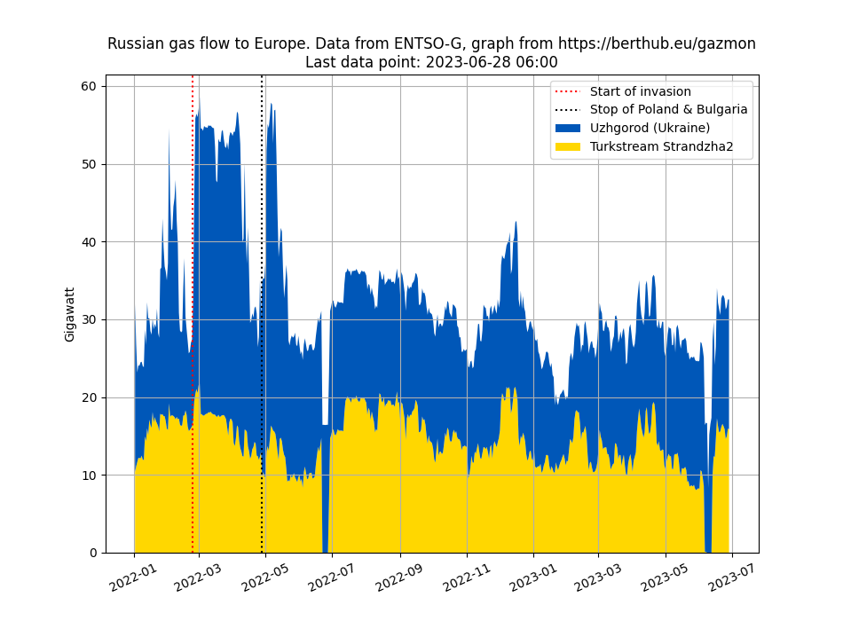
In that post, I also dwell on how we are using that gas to heat our houses and generate electricity. If we are to wean ourselves off Russian gas, or to prepare ourselves for Russia doing that for us, we need to find replacements. Solar and wind energy could play a supporting (if not leading) role there even in 2022.
To figure out what The Netherlands is doing there, I studied the figures we send to the European Network of Transmission System Operators for Electricity (ENTSO-E).
Due to Transparency Regulation (EU) No. 543/2013, EU member states must send figures on power production, load, balancing, outages and transport to ENTSO-E. Not all countries however work equally hard on providing these numbers.
Specifically, The Netherlands reports no numbers on solar energy generation. There are however numbers on utility scale production from gas, coal, nuclear, wind (onshore and offshore), waste incineration and an enigmatic ‘other’ category.
Update: I wrote a page on the messy numbers The Netherlands reports
Solar power
Actually measuring solar power production is of course very hard. While there are some large utility-scale solar fields here, there is a ton of private rooftop generation as well. And these people have no place to report their production figures, and even if we had such an interface, not everyone would participate.
Despite us not having any actual measurements going on, there are lots of sites that report realtime numbers. One example is energieopwek.nl. So where do these numbers come from?
It turns out that an institute called Entrance, part of Hanze University of Applied Sciences Groningen, has created a model which incorporates a ton of parameters on large solar fields, temperatures, irradiation intensity, panel orientation etc and from this creates a prediction.
All places I find that report on Dutch solar power production appear to get their data from this Entrance model. Not everyone appears to be aware these are estimates from a model - the numbers are often reported as facts. Note that energieopwek.nl clearly states that the numbers are estimates.
Usually if a model is that important, there is a scientific paper somewhere outlining how it works. Ideally the model would even be published with sufficient detail that other people could validate the assumptions.
I’ve asked around and I’ve been told that there is no paper and no public documentation. The Entrance model is truly a black box. Which is sad for a model that is so influential.
Now, I have no indication that the model is wrong, or that the people involved have bad intentions. It appears the numbers they are generating are plausible. But I like it when important data is provided transparently.
Update: I’m starting to have doubts about the model.
An alternate way of calculating Dutch solar production
From ENTSO-E, we can get all sources of electrical power generation in The Netherlands. We also import and export a lot of electricity, and luckily, this data also gets reported to ENTSO-E (table).
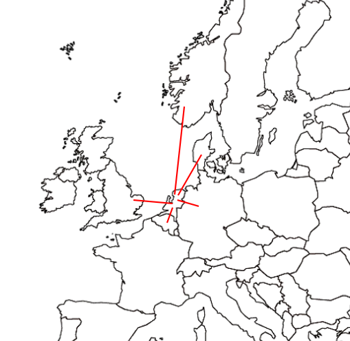
The electricity market is extremely dynamic. Over these five national borders, electricity typically flows in alternating directions. Sometimes power goes from The Netherlands to Belgium, sometimes it is the other way around. Meanwhile, electricity can also transit a country. It is well possible that Danish wind power passes through The Netherlands to the UK.
A look at non-solar electrical Dutch power production is quite confusing:
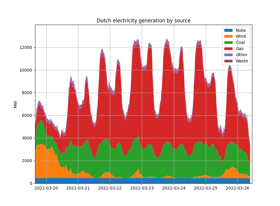
Clearly a lot is going on here. Every day has multiple peaks and troughs. On some days, far less electrical power is generated than on other days. The reason this is all so messy is that this graph is heavily influenced by solar power and the import & export of electricity, but none of this is explicit. Let’s adjust for import/export, and bunch all non-solar sources together:
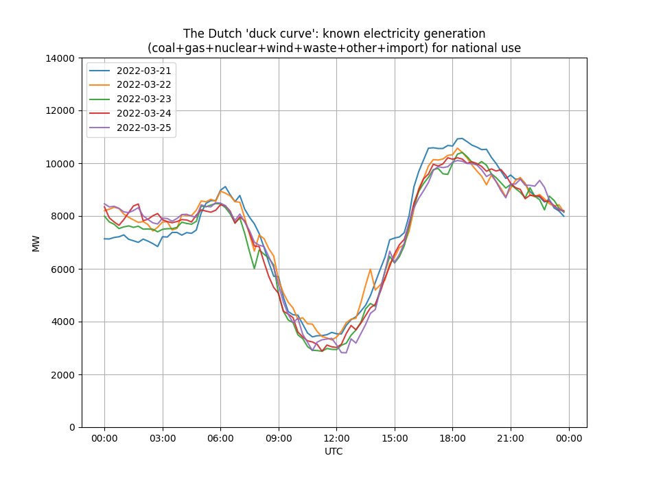 Here on this ‘duck curve’ we see five work days of an extremely sunny week. This is all national electricity production (except solar), with added to that how much energy we imported, and subtracted how much was exported. This turns the previously international graph into a Dutch graph. And there is now a very regular pattern of non-solar energy production meant for national consumption. In fact, this IS the national energy consumption, minus solar.
The big dip centered on noon UTC is in fact caused by solar power. As solar panels inject more electricity into the network, the other power sources simply have to ramp down. Otherwise that electricity has no place to go. Now, by eye it is already possible to estimate the size of the dip, simply by assuming power use will grow somewhat from 6 AM onwards, until it hits the 18:00 UTC timepoint, where solar production is already minimal in March. It appears the dip might represent around 8 GW.
Graphically:
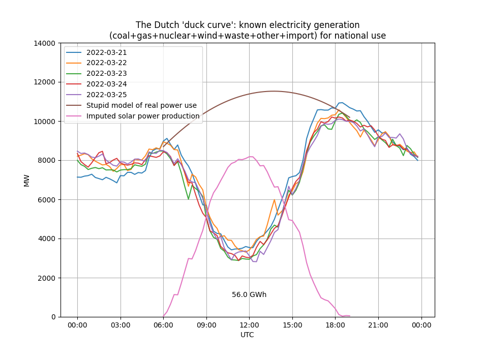 The brown arc is a very cheesy estimate of what power production might have looked without solar power. The distance between that line and what actually happened (the daily lines) represents the unreported solar energy production. In purple, I’ve plotted that distance. The area under the purple curve represents total estimated solar power production per day (for this week). And this is a healthy 56 GWh.
Now, is this number any good? By eye it at least does not look unreasonable, but the estimate of what energy production (and consumption) would have looked like without sunlight is an extremely simple guess. Still, it is not going to be wildly off. But it is not good enough for precision statements.
So what did the professional model say for this week?
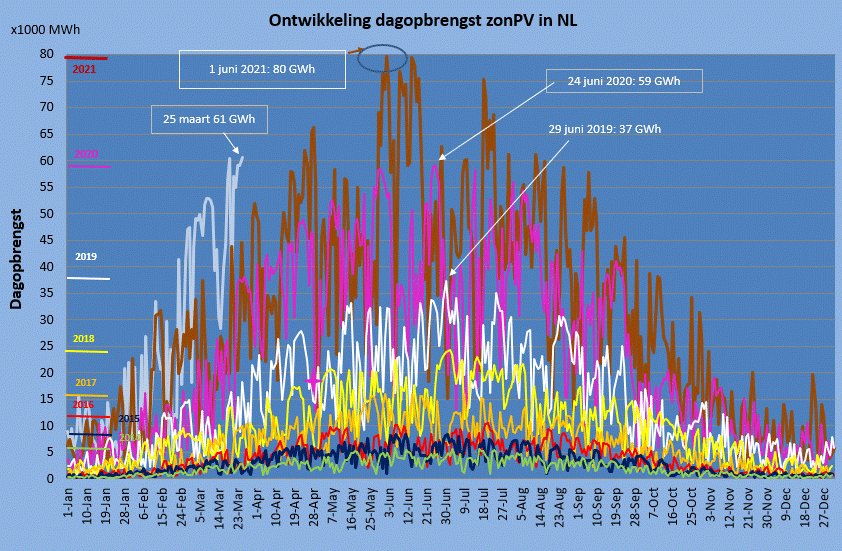 Source: Tweet by Martien Visser
The white-ish line annotated with ‘25 maart 61 GWh’ represents 2022. And lo! The average over the past few days is pleasingly close to our 56 GWh prediction, only slightly higher.
Now, this does not mean that the simple model is good. The week analysed above featured very steady electricity use, and unseasonable amounts of sunlight. This was probably the easiest week to analyse all year.
What it does tell us is that the proprietary Entrance model produces plausible numbers, which is good to know.
Update: it appears Dutch electrical power generation reporting is shoddier than I thought, and does not include whole gigawatts of wind power. I’m no longer so sure of the Entrance model.
But since everyone appears to rely on the model, it would be even better if we knew how it worked and if third parties could validate it.
The simple model
For anyone wanting to try the simple model, it can be found on this GitHub repository, specifically the energy-use.ipynb notebook. You need to feed the model ENTSO-E CSV files, which currently requires making an account and laboriously clicking through the ‘Production’ page and the five Dutch Cross-Border Physical Flow pages. Be sure to get the UTC versions. The GitHub repository also includes a copy of this data up to the 25th of March, which should save you some clicking.
The model interpolates the data so all sources are at 15 minute intervals. Some countries / interconnects only report a hourly, which could confuse things.
For now, I have not automated fitting the presumed ’no sunlight’ electricity production, so you have to do that manually.
Good luck!
Further reading
- Observational daily and regional photovoltaic solar energy production for the Netherlands, a more documented model being built by Dutch national statistics organization CBS in collaboration with the University of Utrecht.